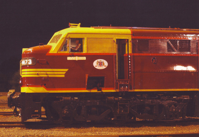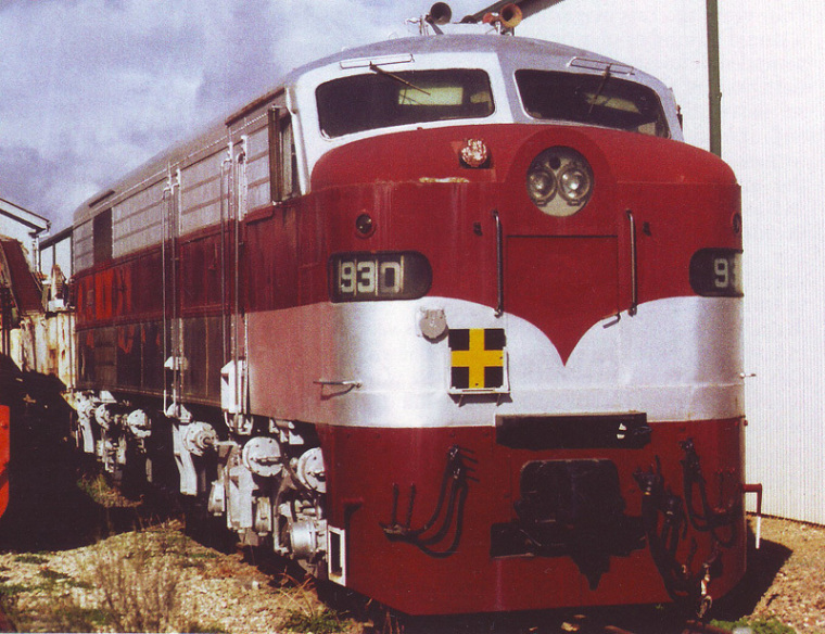
The Footplate Padre says diesel liveries have character.
High tech special new paint has reduced debris build-up on passenger aircraft and improved the aerodynamics and a saving in fuel costs was so evident that it might save 100,000 pounds.
The British Airways comprehensive testing saw the fuel-saving paint applied to a Boeing 777-200 after successful trials on an Airbus A318 serving New York and London route. Rising fuel prices have driven airlines to seek new ways of cutting weight and improving efficiency to allow the planes to fly with less fuel.
The 'paint colours' plays a very important part in our lives and consultants are involved in a wide range of professional advice providing input into the colour and texture of paint for internal and external corporate offices blocks, government buildings, schools, libraries and, even the humble home.
There are various web sites that provide such guidelines, one of these states that the right colour gives a paint job your personal mark. An understanding of colour families, hues, values, and tones gives you the tools you need to make the right choices.
There are sites that provide a tutorial for paint selection. One of these states the following, to complicate the situation: "Once you have selected multiple systems return to the top of screen and select view specifications" Oops, say that again!
There you have it, as the do-it-yourself model becomes so overwhelming that for large projects paint consultants become the norm whereby a philosophy of the project becomes the guide to the colour selections.
Colour schemes across the board
The livery of Australian locomotives fall into such categories whereby today with companies engaged in train running display 'company corporate colours' and become part of the paint project. Gone is the beautiful blue of Queensland's QR diesels, representing the Sunshine State or the magnificent dark blue with yellow trim of those huge Victorian diesels.
I recall the talk of Moruya, a small coastal community on the south coast of New South Wales in the mid 1990's was the new library and its purple panels – indeed they fitted in well with the local eucalyptus.
Likewise, the brilliant yellow on the new multi-storey Southern Cross University adjacent to the Gold Coast Airport, on the New South Wales and Queensland border in Tweed Heads. Looks great!
Another highlight when being transported by coach between Auckland's airport and the city when I've flown to Auckland - a set of split level town houses on the right hand side on the side of a hill - colours were chosen for each unit. One is painted apricot, another violet, and another a light pink, another blue, another a light green and so on - very eye catching.
Now we learn that motor vehicle buyers take colour very seriously and when the economy is down so too this reflects the purchases' choice of colour.

Churches and paint colours
Internal paint is also a carefully crafted art and the varieties of colours to choose from are legion. This brings me to the nature of colour paint selections for Churches.
For hundreds of years colour selections were very conservative with beige and light cream tones but in recent years all that seems to have been challenged. Many of the larger Pentecostal churches have chosen more adventurous colour schemes for both the sanctuary as well as other areas such as offices, play group, the coffee shop, the gymnasium, the indoor sports hall and the like.
I recommend that next time you're in your own church or visiting another, take a special interest in the colours. The variety will be of interest and will say something of the philosophy of that ministry. Increasingly today, leaders have a huge influence on such designations and this becomes part of the story and ministry of that place.
Recently I worshipped at a Sydney church where the dark cream paint was peeling off and was told there is a rising damp issue. Once that is solved they will do the paint job. This church has oodles of littlies and my comment was that within 10 years these will be teenagers, so why not consider the colour scheme, maybe a lilac (neither bright or dark pink) to align the church with the developing youth. Many new churches have already taken such a course.
Nothing of this is new. The colours of the Tent of the Tabernacle were carefully spelt out with spiritual significance as stated in Exodus 26 verse 31, and 27 verse 16. I recount that one of his very first books given to me to initiate my private theological library was a book titled: "The colours of the Tabernacle".


Dr Mark Tronson - a 4 min video
Chairman – Well-Being Australia
Baptist Minister 45 years
- 1984 - Australian cricket team chaplain 17 years (Ret)
- 2001 - Life After Cricket (18 years Ret)
- 2009 - Olympic Ministry Medal – presented by Carl Lewis
- 2019 - The Gutenberg - (ARPA Christian Media premier award)
Gutenberg video - 2min 14sec
Married to Delma for 45 years with 4 children and 6 grand children